

The Gravel Project is an award winning, Boston-area rock/blues fusion band, created by guitarist, vocalist, and songwriter Andrew Gravel. With his brother, organist Jordan Gravel, and up to four other world-class performers, The Gravel Project electrifies crowds with inventive original songs, creative interpretations of well known classics, and high-energy group improvisation.
The band initially approached me (in 2017) needing a sharp, professional press kit. We hit it off and quickly went on to completely redesign their website, and produce cover art and package design for their LP, Wishful Thinking, with supporting merchandise and promotional materials. In the years since, they've trusted me with handling design for many more studio and live albums, info graphics like tech riders and merch guides, and adapting promotional materials to deliver on their evolving promotional strategy.
"…After listening…[Tye] completely understood our motivation…a more user friendly and visually appealing site…that directs visitors to the pages that are most important. Even when the website was complete, Tye went above and beyond again…with instructions on basically everything I'd ever want to use the website for."


CONCEPT: Seeking a vintage, 70s throwback vibe but with a modern treatment, The Gravel Project had selected an abstract painting by artist Angela Chvarek for the Wishful Thinking album cover. The complex colors and patterns of the painting indeed feel very characteristic of The Gravel Project's rich, rhythmic, and moody fusion of rock, funk, and blues.
TYPOGRAPHY: Using a horizontal adaptation of the band's standard logo, the outer typography is arranged in a "stripe" pattern, bisecting the artwork and wrapping around the eco-wallet packaging, contrasting from the circular artwork without heavily obscuring it. A scaled drop-shadow applied to the album cover typography provides a sense of depth, further separating the text from the painting underneath. Throughout the design, information is distinguished with rhythmic spacing, alignment, and alternating colors adapted from those in the painting.
ON-DISC LABEL: The circular nature of the artwork fits the shape of the disc like a glove. To work around the central hole, the on-disc typography returns to the band's standard logo, arranged side-by-side with the album title, instead of stacked.
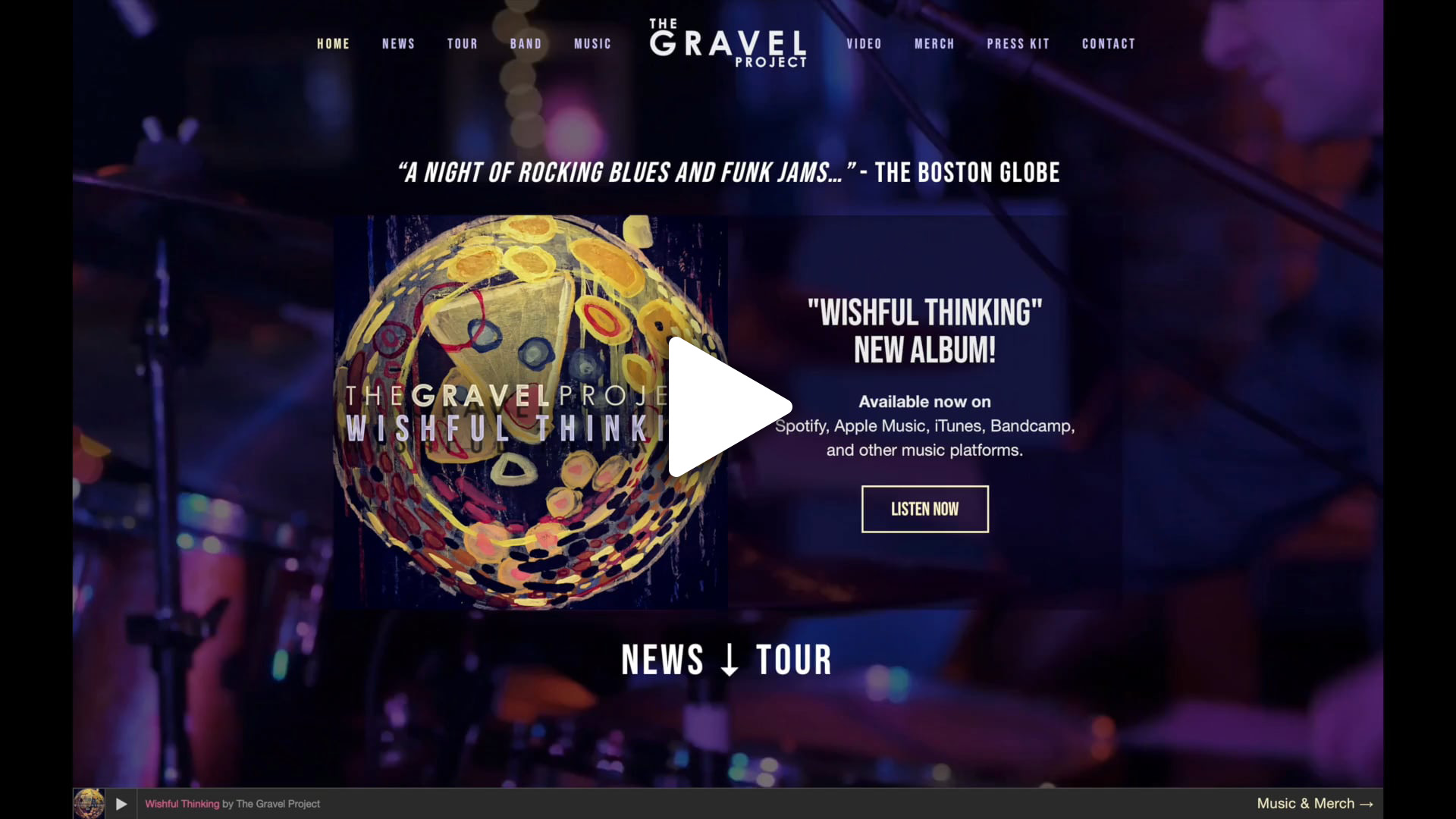
Live: www.thegravelproject.com
THE PROBLEM: The Gravel Project felt their existing website was outdated, visually unappealing, poorly organized, and most importantly, difficult to manage. It was built using the WordPress platform, which powers very many beautiful and successful sites across the web, but can be prone to complex maintenance challenges, causing the band to rely on a web developer for general website management.
THE SOLUTION: For The Gravel Project's new website we turned to the Squarespace platform, allowing for rapid development of a beautiful, rich site, that's easily updated and maintained personally by the band, on a modest budget. It also provides a mobile-responsive structure with minimal effort, which means that everything looks and works great on any device. Using custom code and third-party integrations, the foundational template is easily tailored to the specific needs of the band.
THE RESULT: The resulting design showcases engaging content with immersive, full-width photo and video backgrounds, while the navigational structure streamlines visitors effortlessly to the content they seek: highlighting new music from Bandcamp and SoundCloud, tour dates from Bandsintown, tour photos from Instagram, video content from YouTube, news updates from the blog and social media, newsletter signup with MailChimp, and smart links to major music distribution platforms using SmartURL. A well-groomed digital Press Kit is also prominently located in the main navigation, ensuring that important professional networking communications enjoy minimal resistance.


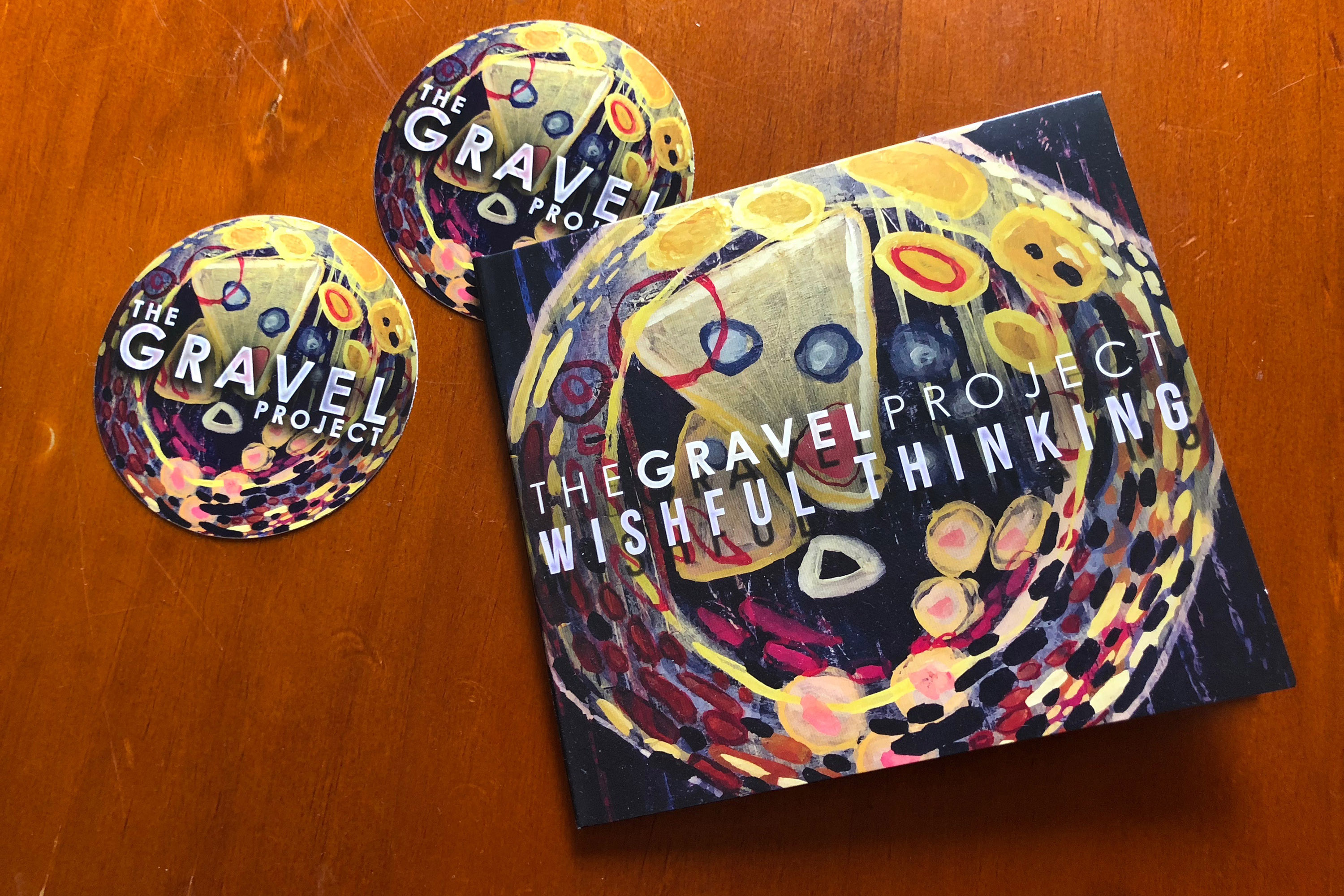
APPAREL: For this T-shirt design, based on the Wishful Thinking album artwork, the band rehired original artist Angela Chvarek to create a special adaptation of her painting using only four colors. This simplified adaptation was then converted to vector art and integrated with the band's logo, and the design was screen-printed using five different color separations, including white.
STICKER: A circular sticker design was a natural choice for adapting the Wishful Thinking album artwork, opting for the band's standard logo—instead of the linear album version—for better visibility at small scale.


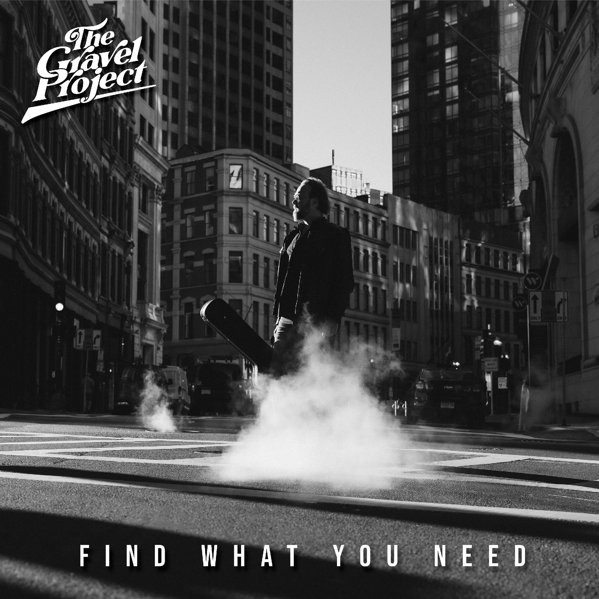
CONCEPT: For The Gravel Project's 2025 LP Find What You Need the band sought to capture the story of the album's title in a single image, depicting the band's frontman, Andrew Gravel, as a protagonist, searching the streets of Boston for what he's missing.
COVER IMAGE: Our first task was selecting the best image from their 32 favorites captured by photographer Ian Urquhart. The chosen cover image is the result of a chance puff of steam, billowing from the hot pavement surface, creating the dreamlike illusion that Gravel is stepping through (or out of) a cloud-like portal—as if in pursuit of some illusive dream, surrounded by concrete reality.
BACK SIDE: The back cover peeks behind the curtain, telling the story of the album's recording process through six more photos, one for each member of the band.
TYPOGRAPHY & PALETTE: The pure black-and-white palette paired with clean, movie-credits–style typography were chosen to evoke the distant, nostalgic tone of classic cinema.
ON-DISC LABEL: In contrast, the on-disc label presents the same clean typography but with a vintage-style, solid red, instantly commanding attention.
FORMATS: The album design was rendered in high resolution for the vinyl record sleeve (shown above) and was also scaled down and adapted for CD jewel case.
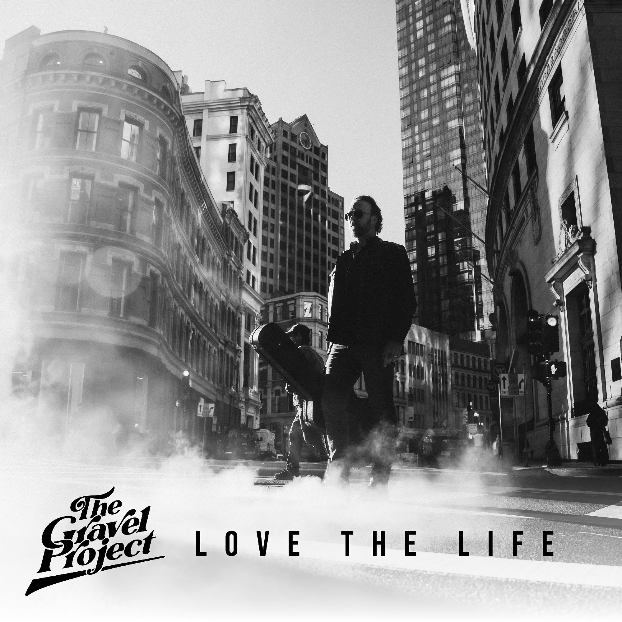
DIGITAL SINGLES: The digital cover art for single "Love the Life" features an alternate photograph of Andrew Gravel, from the same shoot, with the steam framing half of the image in a pale haze, allowing the typography to be inverted in black instead of white.
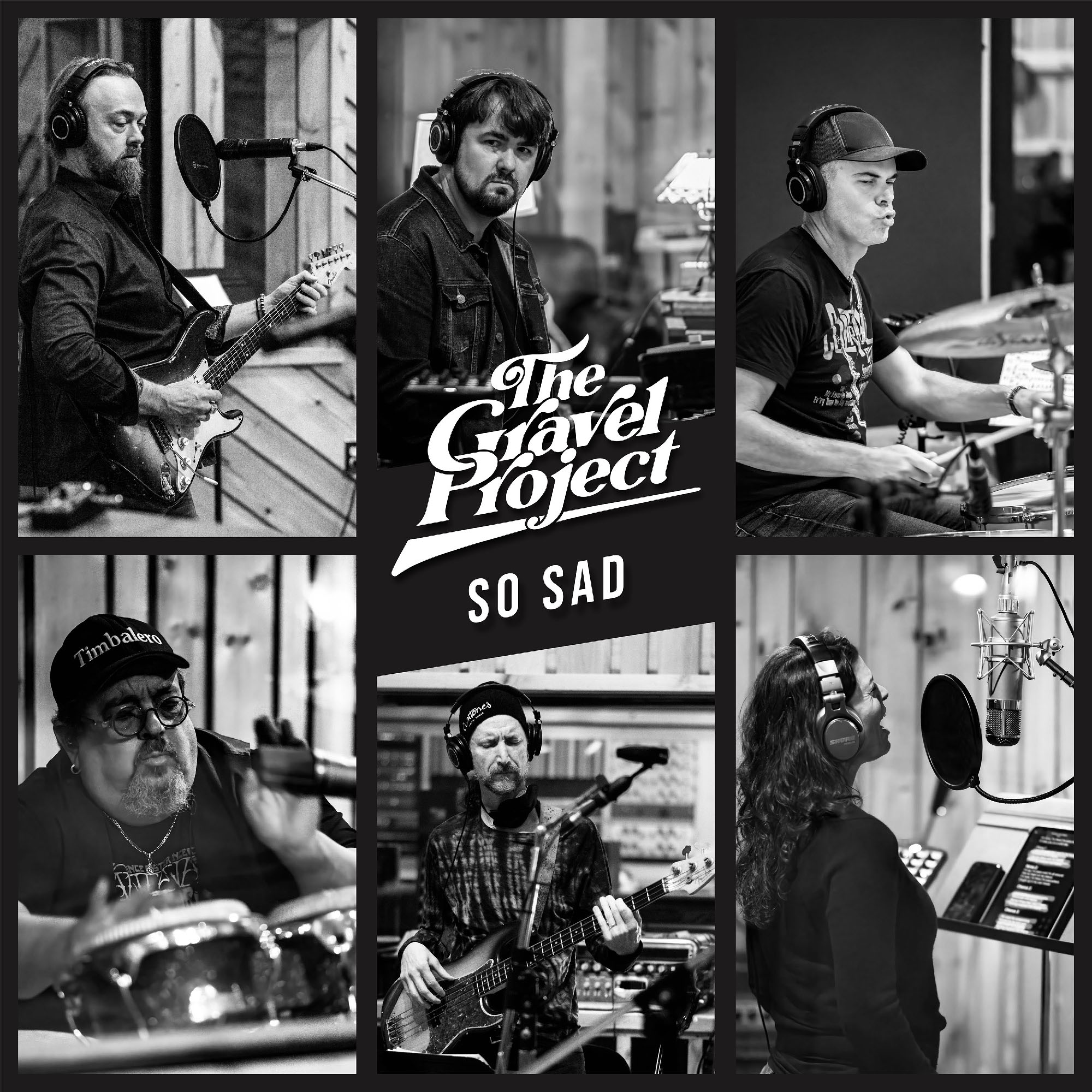
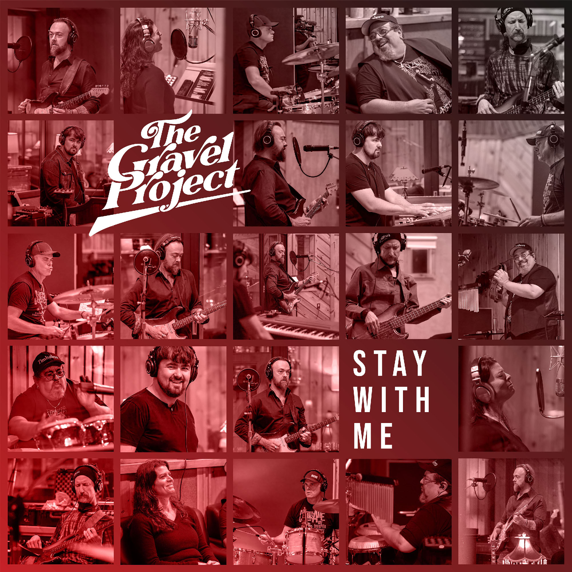
Two more digital single covers, for "So Sad" and "Stay With Me," feature collages of photos from the recording studio shoot—the "So Sad" cover recycling the same shots used on the back side of the album sleeve, and "Stay With Me" featuring an extended range of moments from the album sessions, in a tiled grid, with an attention-grabbing, monochromatic gradient based on the same red used for the on-disc label.
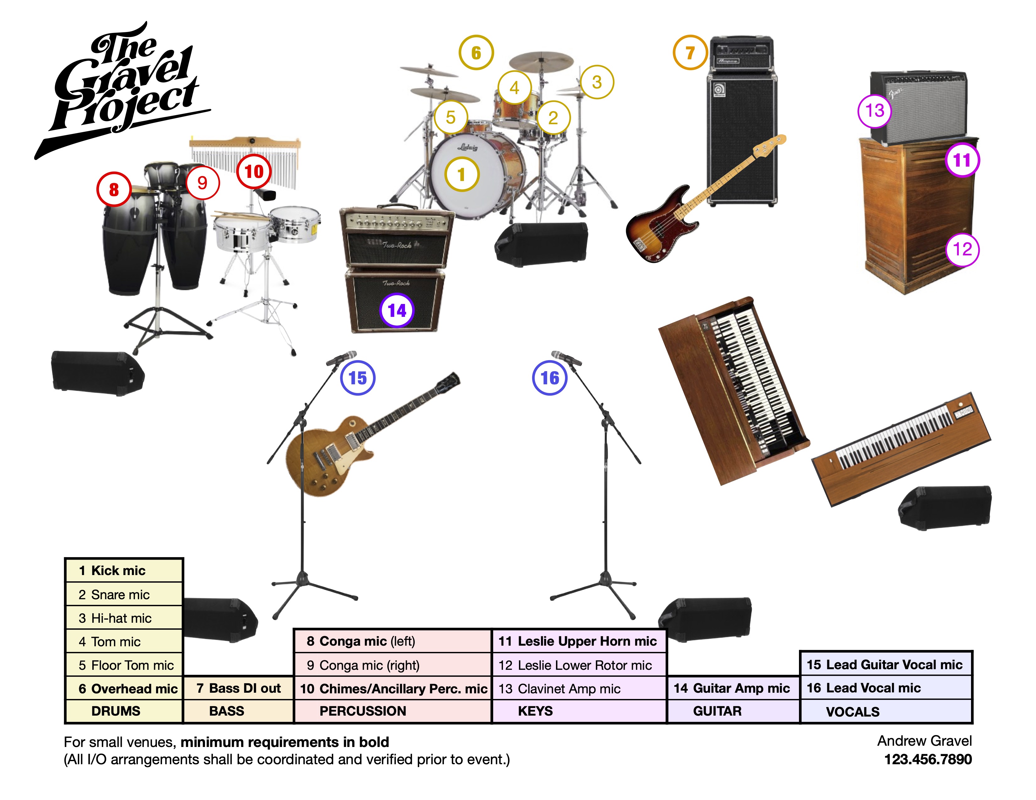
BRIEF: Since The Gravel Project's stage lineup varies anywhere from four to six band members, in seven possible combinations—and sometimes the result of some last minute changes—Andrew Gravel was finding he often had to sketch out stage plots for venue sound crews on the night of live performances, which to him felt tiresome and unprofessional.
There are plenty of online tools for creating these, but the results are generic and underwhelming, so Andrew approached me about creating four highly professional and accessible tech-rider sheets, one for each of their four most common lineups. (In the end, I delivered a sheet for each of all seven of the band's possible lineups.)
STRATEGY: After researching differing examples—with a range of art styles and organizational approaches—the goal was to simplify down to just the details that seem most essential to sound crews, and to display the information in the clearest way, that is both aesthetically pleasing and cognitively a breeze to use for everyone involved.
SOLUTION: The result is a streamlined, color– and type-weight–coded stage plot, visualizing instrument positions with just their inputs* plotted and listed in groups by band member and/or instrument. (*Preferred positions of stage monitor speakers are visualized, but without cluttering the sheet by listing these outputs.)
GRAPHICAL STYLE: After considering a minimalistic illustrative style, there was a slight preference for using photos of the band members' actual instruments, or close approximations. Since the intent was to deliver the sheets digitally, there was no concern about how well the photographic style would print.
INNOVATIONS: Two innovations, not found in any examples that turned up in research, were 1) the color-coded grouping by band member and/or instrument, and 2) the use of bold weight type to indicate minimum required inputs for venues with fewer resources without adding more than a single line of explainer text.
VERSATILITY: Although Andrew initially requested just four stage plots for the band's most common lineups, as the project progressed he was happy enough with the results that he decided to invest in two more, and I even through in a seventh, covering every permutation of The Gravel Project's live show. (The example shown above is for the full six-piece version of the band.)